Search This Blog

Evaluation

In general I am happy in how my map I created this project turned out. I believed that I followed the sci fi theme quiet well and managed to create a sci fi map with a great mood and atmosphere using the Cry Engine 3 tools. I focused on very different and individual aspects of my map such as lighting, area space, texturing and high/low ground.

I divided my map into two areas with one main middle confrontation area. While the two areas would be allocated to each of the teams the middle area is for high confrontation between players. The main objective to get to is the tower on the second floor where two snipers would be place so you can get a few easy kills taking out the opposing players. The bendy tunnel are there so player from the two different team will get lead into close quarter combat you could be going around the tunnel and up walking into the opposite player and stabbing them with you knife.

I wanted to make my map equal so no players have a better high or low ground advantage. Or better players have a better advantage over newer players like the second floor on the tower there’s always a chance to shot or snipe a player from the ramp areas.

Out of all the things I used to make my maps feel sci fi I think the sci fi texture I used on the walls around my map really gave my map that big sci fi fell also the lighting that portrays different moods in different areas.

I felt to improve on my map I could have stuck to Maya and achieve to make my Maya building feasible in my map instead of scrapping the idea I could have found out how to make my building a solid. It also would have been a better advantage because my building could have looked more sci fi’y compared to how I made it in Cry Engine 3 with things floating around it.

Also the sci fi texture I used around the whole of my map did feel a bit repetitive and in some areas or for different walls/objects I could have used different textures. I do like the texture of my map just saying how I could have improved or used an alternative texture to make it look or feel a bit different.

I never mentioned this before but on my pencil and digitally draw map concept art I wanted to have gates at my spawn points I indeed have gates in my finished map at both spawn points well a gate frames to be more specific . . . But in planning I wanted to have actual gates that functioned properly by opening when you walk towards them and closing when you walk a certain distance away from them. In my finished map this is clearly something I managed not to achieve. If I had more time to improve my map I would make both spawns with gates that functioning by opening when you walk towards them and closing when you walk a certain distance away from them.

Now I will explain how my level design related to my actual brief. The budget is something typically used to create game/game components. In a proper gaming business you would have to work out how much budget your project would require usually it would work out if your game/game components you was making was quiet big in terms of big level design, big story’s or very detailed or unique graphics you would have a big generally also if you have quite a big team of people to create your game you would have to pay them which will also be part of your budget.

Also you would have to work to project schedules like in this case you would release a release date of the game to the public so they would know when it’s coming out also you have to give retailers a few weeks’ notice to stock the games in store.

I think the budget I would have had for my level design would have been fairly alright. I probably would have had a small team of people around three including me to build my multiplayer level and the objects including characters. I think my budget wouldn’t be any higher than £300 and my team would be happy with £100 each for the whole project.

The schedule for my project was set by my college tutors and I had 8 weeks to finish my project to a good standard for marking by my college tutors and I had an additional 6 weeks to improve my multiplayer and my blogger before it really gets sent off to the examination board for marking. I think I have used my time wisely a have managed to complete my blog to an acceptable standard in the 8 weeks we first had until it was marked by my college tutors. In my additional 6 weeks I’ve had enough time to improve my level and blog more.

The brief also states that the studio wants you to create a game that’s a triple “A” multiplayer shooter and to not compete with games like call of duty and have asked the product to have a sci-fi feel.

I think my has all the aspects to be a triple “A” title by having low and high ground to provide different classed players with same advantages and by using sci-fi cry engine 3 texture which has that certain pattern on the wall also the lighting I use fits the specification very well.

My level worked well using the default cry engine character to navigate it

There are many things I could have changed about my map but in all I think it worked out pretty well believed I kept to the brief on making a multiplayer map with a sci fi theme.

The finished map and my conclusion

My finished map and my conclusion

I finished to my map and will write a conclusion of what I thought about this project how it went how well I think I did and how well my map progressed.

I think in this project I worked particularly well in the weeks and time I had to develop and analysed what I wanted my map to look like I think it came out quite well not straying from what my original concept art design looked like. Also along the way I developed a lot of skills using the engine on how to make my map professional. I learned how to base the map around a multiplayer infrastructure. Making sure area is far and high and low parts of the maps are well based.

Constructing my building (The final leap towards the end of my map)


The first thing I tried when trying to construct my building was to make it in Maya and export it into Cry Engine 3.After getting help to install the import plugins into Maya and Cry Engine 3.When I exported the building Into Maya I found out It wasn’t a solid object and you could walk through it also when exporting the building It came out really small and I had to resize it which came out quiet un-proportional compared to how I wanted it to look in my map. This led me to the conclusion to just scrap the idea of making a building in Maya then to exporting it into Cry Engine 3 and just make a building using Cry Engine 3’s solids and stairs.
Phase 1 of my Building construction (Stairs)
After coming to that conclusion I start to construct the first segment of my tower (The stairs).When making the stairs to my tower I wanted the stairs to get up to the tower directly facing the bendy tunnels so when you reach the furthers part of the map and take the bendy tunnels you reach the directly in front of the stairs first. I made the stairs big enough so that two players at the same time running or walking could get up them.
Phase 2 start of building (stairs with buildings first floor)
Next I started to construct the first floor I knew I wanted my building to have at least two floors to construct the first floor I simply used four solid and placed them around in a square. I also was aware of player trying to jump outside my map so I made sure my building was the right length away from the wall so the players wouldn’t escape. I texture the stairs and first floor level with the same sci fi texture I used to texture the walls around my whole map except I made the colour of it grey
Phase 3 (stairs with building first floor and another stairs)


Now I grouped the stairs the square platform and the other stairs and made the building symmetrical. The stairs are placed where both bendy tunnels end.
Phase 4  (stairs, first floor top floor stairs)


After thinking how I will make the stairs/ladders to construct my second floor I thought it would be a good idea to use the middle rectangular hole on my first floor to put stairs in it to the second floor. I made sure these stairs was the same width and height so I made one set of stairs using two stairs assets grouped and copied them to make my second set of stair the going parallel.
Phase 5 (stairs, first floor and second floor)


Lastly I started to construct my second floor. I constructed my second floor by grouping the four solids I used for my first floor and duplicating them for my second floor then making sure I moved them up accurately without moving them to the side. From the height of the second floor you can see the whole of the map this will be potentially good as a sniper spot in the map there is also a chance other players will be able to kill you from that spot in the map like from the ramps.

The changes altered in the digitally drawn map


I altered what my Digital design of my drawn map would look like. Placing the ramps and the building exactly how it looks and is placed on the map also I placed names of what things are in different areas onto my digital drawn map design. 

Compared to my original map design idea I changes how the ramps where placed due to the actual width of my map and also had to place rock and fence so players couldn’t escape outside the map. Also after I got the basics of my maps done like texturing, ramps and building placement added more objects for cover like boxes, cars and walls.

The change in design


From when I first drew out my map I had to change the design of what I wanted it to look like initially. I found out that I needed to put rocks and fences in places to avoid the player from getting out the map also I needed to change how the ramps look/placed due to the width of the map. Also at first I wanted the main building in the centre of the map to be a proper building with interior and stairs leading to balconies on each level where players can shoot other players.
Map initially draw idea to actual map

Get under cover!

I have aspects of objects dotted around my map I have already explained half of it like frogs ect.


To make a good map you must also have certain things in your map like cover. For cover I have put walls, boxes and cars. Depending how you use the cover in a situation where you’re under fire from enemy attacks can really determine the game situation. Cover like boxes give you the opportunity to fire bullets at someone while your legs and chest is under cover. When receiving fire back while you’re behind a box you and quickly crouch to avoid bullets rather then get into prone position.

Boxes for cover
 
The car that you can get into can be useful because you can get into it and crouch behind the doors for cover and shoot through the broken windows. This may be usefully if you had more than one team member in the car where you could be shooting and a medical team member would refill your health when you received damage.


Objects like cars for cover
There are also walls for cover for about one person this will help you by crouching down and standing up every time you want to shoot.
Walls for cover


The level design continues

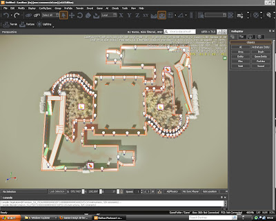
My full map without building
Once I joined my map together I began to texture using an Sci Fi texture.
Cry Engine 3 (3.4.0) (material editor - materials - templates - illum - scifi_metal_b - metal)


add 'Geom Entity's' like trees to fill the empty spots where players can't go once I got to this stage my map was basically finished and I was adding things to make my map more visually appealing.

Vegetation like trees and birds
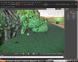
Adding things to make the scenery more appealing from the tab (Objects)like frogs, bugs and birds in 'Entity’. And rocks around parts of the edges of the map in 'Geom Entity' to stop the player from going outside the map. And fences in 'Assets' to stop the player from going outside the map.
Wooden fence to not allow players out the map


Added creatures like frogs
Rocks on edge of map to avoid comming out

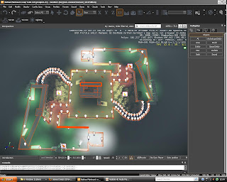
 I also wanted my map to have a unique set of lighting by having different set of lights in different areas of my map. Like it would start out with white lighting in the actual spawn then you would move onto a green section of the area .The bendy tunnels of the area are blue and the straight sections of the tunnel are with red lighting. The bendy blue lighted tunnel leads you straight to each stairs of the building. And the main confrontation area is done with yellow lighting. Like in my older post the lighting brings a sense of different moods.
Whole map lighting in the dark